Struggling to get any real traffic from Pinterest?
Most bloggers know that Pinterest can be a great source of free traffic. But it can often feel like you are putting in a lot of time and effort and not seeing results.
Did you know that your Pin design is the main factor in someone clicking on your pin?
And you don’t need to be a graphic designer to create amazing pins. Just by following some basic design principles you can create some viral pins quickly.
This podcast with Kristin Rappaport from Applecart Lane will show you exactly how to create a pin for Pinterest that people will actually stop, save and click.
Listen on Apple Podcasts/ Google Podcasts
Why graphic design matters
If you’re like me you’ve probably spent hours designing pins only to find that nobody is clicking on them.
You’re left feeling like…
So you go down the rabbit hole of thinking…
“Maybe my pinning strategy is wrong.
Or maybe I need to use Tailwind Tribes more.
No… I need a manual pinning strategy! That will fix it!!“
Well here’s the brutal truth:
Your pin design is probably terrible!
When you don’t create “Pinterest pretty” pins, people won’t even stop to look at them.
FACT!
Simply put… your graphic design matters if you want to get traffic from Pinterest or make your blog look professional.
But you don’t need to hire a professional or become a full-time graphic designer to make this happen. There are some simple tips you can learn right now to improve your Pinterest game quickly!
Best design tips: How to create viral pins for Pinterest
So you’re probably still thinking…
“But I don’t have an eye for design.”
It doesn’t matter!
By learning the simple design principles below, it’s possible to quickly improve your design skills to create pins that grab everyone’s attention.
Basic Pinterest design rules
There are some basic Pin design rules that you need to know.
This is just Pinterest best practice and will help you get those “Pinterest pretty” designs:
- The pin should be vertical (2:3 ratio i.e. 600 x 900 px… but you can play with the size)
- The image should be clear and relevant
- Text overlay helps get more clicks
- Write big enough for people to read (especially if using mobile devices)
- Warm colours tend to do better (pinky/ red)
- No pictures of someone looking at the camera
Now that’s covered let’s get to the juicy part…
1. Proximity
Proximity is basically the spatial relationship between the different elements in your design i.e.
- Header
- Subheader
- Call to action (CTA) i.e. click now to learn more
- Picture of a freebie
All you need to know is that elements that belong together, stay together (I mean… should be close to each other.)
And other elements should clearly be separated.
The below image shows a poor design on the left and a great design on the right!
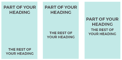
Pretty simple right?
2. Alignment
This is pretty obvious when you know it.
You won’t be able to ignore this ever again!
You can align your text to the left, middle, right or justified as below…
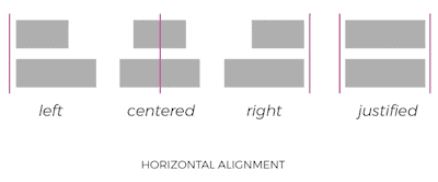
This is the same with vertical alignment.
The aim here is to keep each element of your design the same.
You can have a call to action aligned to the right, whilst your heading is aligned to the left. But it looks weird if you have part of you heading aligned to the left and part of it centred (I know I’m guilty of that in the past!… Thanks Kristin!)
3. Repeat, repeat, repeat
If you’re like me, you love time-saving tips.
The best thing about this is it will help you look more professional… and save time!
Again, this is pretty simple.

Choose a few fonts, colours and styles that you use regularly across your pins, logos and brand.
Here’s the best tips:
- Choose 2/ 3 fonts
- Create a colour palette of about 5 colours (you can include black and white and use a free colour palette tool to choose around 3 others)
- Use similar styles i.e. arrows/ boxes
Now write them down in your notepad or somewhere you have access to regularly.
I use Evernote (it’s free).
4. Contrast
Possibly the most important design concept.
This is the way to make the biggest difference VERY quickly.
You can use contrast by changing:
- Colour
- Size
- Shape
- Space

This is really only skimming the surface as there are so many variations you can use. Even within one pin!
The aim is to draw your viewer’s attention to a particular element and make certain words “pop” off the page.
5. Hierarchy
My personal favourite new design principle!
There should always be a “hierarchy” of the order you want your viewers to see elements on your designs.
In a pin that order may be:
- Heading
- Subheading
- Image
- Call to action
- Your URL
Check out the two pins below…
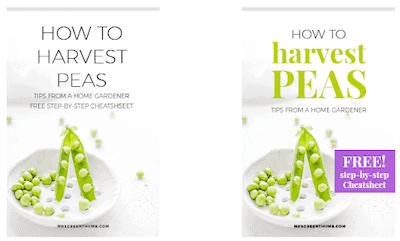
The one on the right draws your eyes to the words “harvest peas” first. The image of peas confirms your eyes read it right! Then you can see the CTA has a free checklist.
So you may want your viewers to see your CTA before your subheading.
Or maybe the image should be the first thing they see.
Your hierarchy is super important in conveying the message you want. And the majority of people do not even consider this when designing pins.
Boom!
You now know more than most blogger pin designers!
Related content:
- How to Use Pinterest for Beginners
- 5 Pinterest Hacks to Get Viral Traffic
- Who Else Wants Free Traffic? Find Easy Keywords for Your Website
Quickly create viral pins- creating pins in Canva
This is exactly how to create a pin for Pinterest on a budget.
You have to use Canva.
It’s free, has amazingly easy to use tools and saves so much time.
With that said, here’s Kristin to walk you through how to use Canva…
But Kristin also added in an amazing value bomb in the podcast…
How to create 50 Pins in an hour
This is amazing!
Here’s what you need to do…
Time needed: 1 hour.
How to create pins for Pinterest quickly
- Choose 5 of your best blog posts
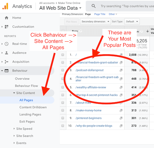
Use Google Analytics to see what posts are performing the best recently (or the best posts ever).
Top tip… choose one category if you have multiple categories you blog about - Create 5 pin templates on Canva
Use Canva to create 5 templates that you can use for your best posts.
The image needs to match all 5 posts, which is why it’s important to. choose one category! - Create 2 headlines for your best 5 blogs (10 headlines total)
Top tip- use free online tools such as Aminstitue or CoScheduler to see how catchy your headline is. Learn 13 ways to create headlines that catch attention here.
- Insert your 10 headlines into the 5 templates
Pay attention to the hierarchy each time. You may want certain words to pop out or add in different CTA’s.
To be fair… Kristin did say you may need to spend a bit more time designing your 5 templates.
But this is certainly possible and a great little hack that I will personally be using… a lot!
One of the main messages throughout the chat was to…
Keep it simple stupid!
This is one of the most common mistakes when new bloggers are learning how to create a pin on Pinterest…
Most people try to add in fancy little design elements to make it look like they are a pro designer (I’m holding my hands up right now… typing with your nose is hard FYI!)
Just make your pins and all your designs simple.
Don’t add in crazy shadow effects or colour gradients.
Keep it simple = save more time + make your pins look more professional.
There were some other little gems thrown in by Kristin too…
Best free graphic design tools
Here are some super helpful (free) graphic design tools you can use:
- Colorzilla (Chrome colour dropper extension to choose any colour you see on the screen… great for matching colours to an image)
- Photopea (make transparent backgrounds and more fancy things)
- Creative Market (free fancy designs and patterns etc.)
- Ivory mix (get awesome stock photos… it has paid versions too!)
All of this awesome value, but you may still be wondering…
How to create a pin for Pinterest & post it
Now you know how to create a pin for Pinterest, how do you actually post it to Pinterest?
There are numerous ways and even if you already know one or two ways to do it, there may be another sneaky time-saving way that you aren’t aware of…
Use the Pinterest Chrome extension
Simply install the Pinterest extension.
Whenever you are on any website you can click the Pin button and you get to choose any image that is on the website.
Remember to add your description for the pin using keywords.

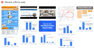
So if you upload your pin to your blog, you can easily pin from there.
Use your social shares plugin
There are loads of social share plugins out there and everyone will tell you theirs is the best.
I use Social Warfare as it doesn’t affect the website speed and I love the features (even in the free version!)
Simply click the extension that looks like this and pin it. You can even try the one on this page now 😉

This method will again need you to upload your pin to your blog post.
Add from a website in Pinterest
This is the third way of saving a pin from a website.
Personally, I don’t know why anyone would ever choose this option as it seems silly.
But maybe you want to just stay on the Pinterest platform and you know the exact URL you are looking for?
Anyway here’s what to do…
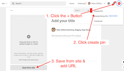
Upload a photo in Pinterest
You can do this without needing to upload your pin onto your blog.
This is great for designing multiple pins for one blog post. It means you don’t need to add a load of pins to one post, which does 2 things:
- Slows the page speed down
- Adds loads of unnecessary pins to your page
Simply:
- Click the + on Pinterest
- Create Pin
- Drag your image into the correct slot (see screenshot above)
- Add your title and description (make sure keywords are in there. Check out this post for more about Pinterest SEO)
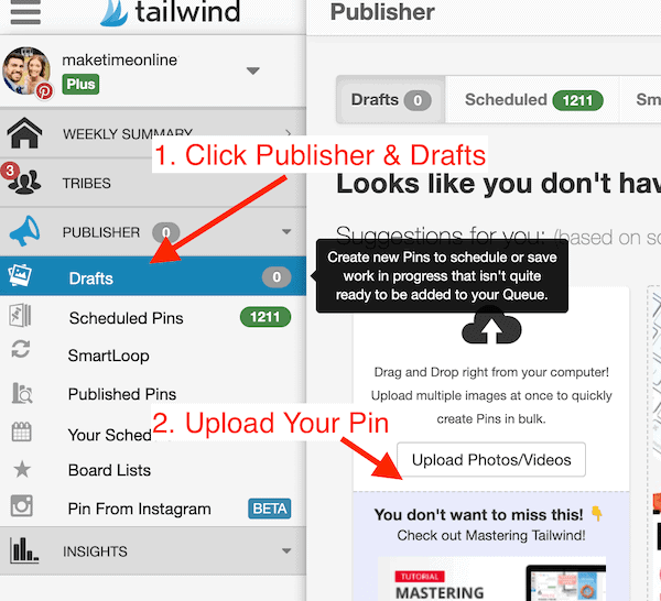
Directly on Tailwind
This is another way you can add additional pins that are not on your blog post.
Note it’s a good idea to make more than one pin per blog post. Read more about why in 5 Pinterest hacks for more blog traffic.
Then you simply:
- Click publisher & drafts
- Upload your pin
- Add title, description and URL & schedule to appropriate boards
Using the Tailwind Chrome extension
This is very similar to the Pinterest extension.
The two big differences are:
- You can upload multiple pins in one go
- You can schedule the pins to multiple boards
Here’s a great little hack to help you pin 100+ pins in a couple of minutes…
If you don’t have Tailwind you can see how much of time-saver it is! (that’s an affiliate link that will give you 100 pins for free to try it out and 1 month free if you upgrade!)
Related content:
- 25 Proven Ways to Make $1,000+ a Month Online
- Blog Income Reports Study- How the 7 Best Niches Make Money
- How does Blogging Make Money?
Full Podcast Transcript
What can you do now?
Check out Kristin’s website Applecart Lane.
She has a 30-minute free course that walks you through these design steps in much more detail.
I’ve genuinely paid over $40 for similar “courses” before (I won’t name & shame them!) and learnt a fraction of the actionable tips that Kristin provides here.
The training is complete with over the shoulder videos and it includes:
- More detail about the 5 design principles above
- How to plan your graphics
- 10 common design mistakes people make
- Branding basics
- Graphic design checklist
- Graphic planning worksheet
It’s epic and I doubt it will stay free for long.
Go to her website now to find out how to get it, before it’s taken down!
Kristin Rappaport podcast summary
So there you go… exactly how to create a pin for Pinterest and make it look amazing!
These “show notes” have ended up becoming a full-on blog post in itself because there really was so much to take away from this chat.
Graphic design isn’t just for people with an “eye for it”.
Anyone can learn these simple design techniques and use them to get way more traffic from Pinterest.
What are you going to do differently in your pin design from now on? Have you got any questions about graphic design?
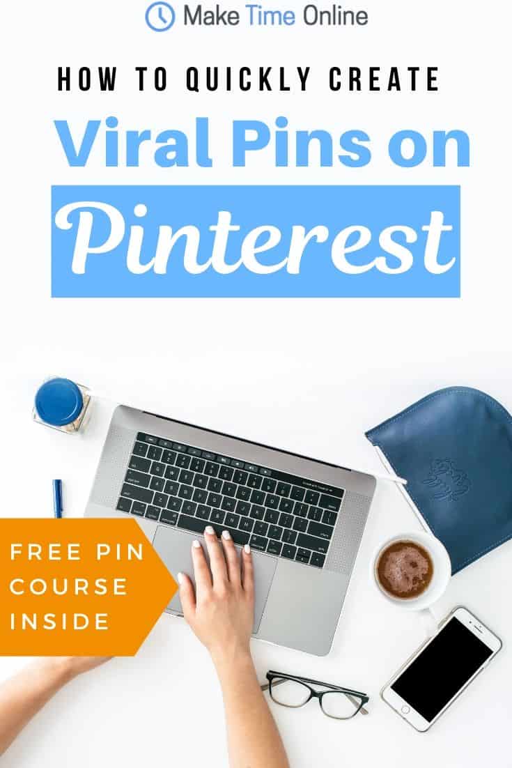
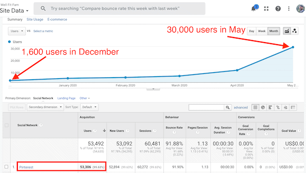
I spent a ton of money on Pinterest courses trying to figure out the "magic strategy" to get traffic.
Then I used Kristin's pin design tips from her Pin Design Perfection course...
This is what happened to my traffic from Pinterest after that...
Click anywhere in this box to get Pin Design Perfection and explode your Pinterest game too!

Thank you for your information about how to make better pins to finally get those clicks in. You made me laugh out loud with the gif – because it’s exactly what I want to do when I think: Oh, this pin is awesome, it will be a hit – and then nothing happens, except me getting frustrated.
“But I don’t have an eye for design.” It was indeed what I said 😊
I appreciate the free graphic design tools you linked. I already knew Ivory mix and I love it, so I will make sure to check others out.
You gave me a lot of work to do, but I feel like I know what I’m doing now – your post couldn’t come at better timing! 😊
Haha, you’re so welcome Katja!
Defo check out Kristin’s free 30 min design course here.
It’s unreal how much you can learn about graphic design in such a short amount of time! I can almost guarantee that won’t stay free for too long as I’ve paid for similar courses that offer a lot less than this one too!
This has to be one of the most helpful posts I’ve read recently! Pinterest is still a bit of a mystery to me, so I’ll be checking out these tips and seeing how it helps drive traffic to my blog! Steff xx
steffsjourney.com
Thanks Steff, I’m glad it could help!
There’s a lot to learn with Pinterest to be totally honest. Some people make it sound super simple (and it is once you design great pins and put them into the great boards) but there is definitely a learning curve if you’re new to it!
Persistence and practice pays off in the end though!
Initially, your advice on this method seemed rather complicated, laborious and lengthy to me, but when I tried to do everything myself, I realized that I was wrong.
Glad it helped!
These are great tips.
I am gonna have to go through them slowly and apply them to a specific pin I am about to create.
Thanks a lot for the valuable information.
Glad it helped Michal
I always get such great value from your posts. I made screen shots of several spots to use later.
I’m terrible at making “Pinterest pretty” pins so I’m looking forward to trying these tips.
Haha thanks Jamie. Check out Kristin’s tips in the link at the top of this page, they were a game changer for me (I am also design illiterate!)